This week end, I was playing with a map visualization. I wanted to show the difference between the penetration of internet and mobile phones for the Mediterranean area. The easiest way to do it is to use a vector-based drawing of Europe. In my case, I started from a free shapefile of the world (ESRI standard for Geographical Information Systems). Then, I used uDIG, an open source GIS, for removing all the unwanted countries. The next step required the conversion of the ShapeFile into a vector drawing. To this end, I used ScapeToad, transforming the GIS file into a Scalable Vector Graphic (.svg). This format can be imported in most vector-based drawing program. I used CorelDraw. In the drawing, I created a color gradient with 10 different levels. I used a gray-scale palette as I felt that was simple enough for communicating the differences between the countries.
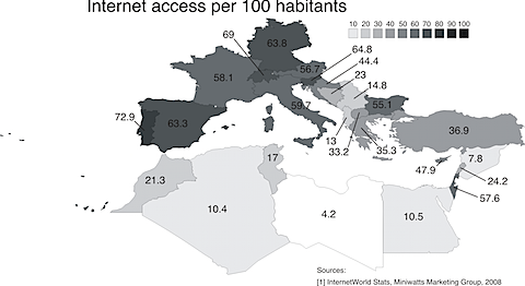
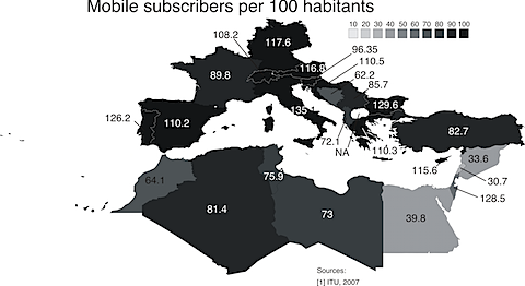
The second element that is required to build these visualizations is a good source of data. For this exercise, I used the Internet Usage World Stats, edited by the Miniwatts Marketing Group. The second source is the International Telecommunication Union, ITU.
The result can be seen in the two pictures below. While for Internet penetration we can see a huge difference between Northern Africa and Europe, the same difference is not visible in the number of mobile subscribers. In other words, while Northern African countries are still catching up to provide electricity and internet access to their populations, Cellular technology is almost available to every citizen. These two visualizations are going to be presented in the Global Information Society meeting, held in Marseille, France, next week.